IV. HUMPHREY'S | Digital Punk
HUMPHREY’S | Digital Punk | 2021
intro
Inspired by the urban street style of the hippest cities, Humphrey’s is an entry-priced house brand targeted at young adults, with mainstream appeal to a diverse consumer base. As the senior product manager, I had full creative control of product planning and development to:
Craft a strong, relevant global collection story.
Analyze collection sales performance to determine product line gaps and opportunities.
Plan and design a collection of trendy but wearable frames.
Develop custom materials that would standout from a saturated field of competitors.
Role + Disciplines
senior product manager
product line management
trend forecasting
market + consumer research
data analytics
design direction (eyewear + cmf)
product development
supply chain optimization
team management
3D CAD rendering created in Rhino and Blender.
market + consumer Research
To develop a new collection story, I conducted market and consumer research to identify areas of growth. The past collections were bold, but they were not current with the new generation of consumer. The collection failed to stand out in a saturated field of trendy, mainstream eyewear brands. While Humphrey’s had always targeted at the youth, the brand also performed very well with the older consumer, seeking wearable rather than trendy frames. I analyzed sell-through consumer data, supplemented with account interviews, to identify the target consumer groups.
Methodologies employed:
Account interviews
Primary sales data analysis
Consumer data analysis
SWOT analysis
trend forecasting
In collaboration with our German team, we researched socio-cultural trends, as well as emerging trends across art, music, and various design industries relevant to the new generation of consumers. Two key themes emerged through the research:
Hyperreality: the hybridization between the real and digital realms, where digital aesthetics influenced perceptions in real life.
Aesthetics of Protest: the rebellious, rule-defying attitude in the increasingly important culture of protest amongst the younger generations and its aesthetic influences on design.
The Digital Punk global collection story was derived from the above themes. It celebrated current youth’s inspiring creativity, optimism, and rebellion, with an emphasis on digitalization and rule-breaking designs.
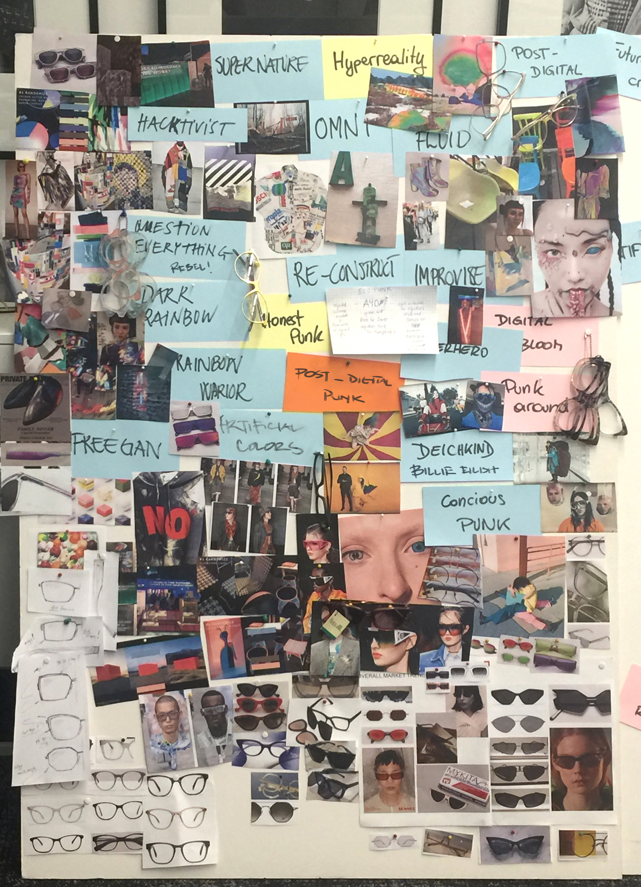
Trend board with global socio-cultural trends, key design themes, and material inspirations.
Design Strategy
With the digital-native consumer in mind, my ideation process was driven by how the designs would digitalize and resonate with them. Key design considerations were:
Decisive, graphic forms with easily readable details and color application that would create an instant visual impact through images
Expressive, trendy front shapes that reflected current street style trends
Thin, lightweight, and wearable designs that appeal to a diverse consumer base
Colors + materials + finishes (CMF)
Translating the creative rebellious attitude of Digital Punk through tactility, I developed a playful, digitally-inspired CMF direction that would pop on screen:
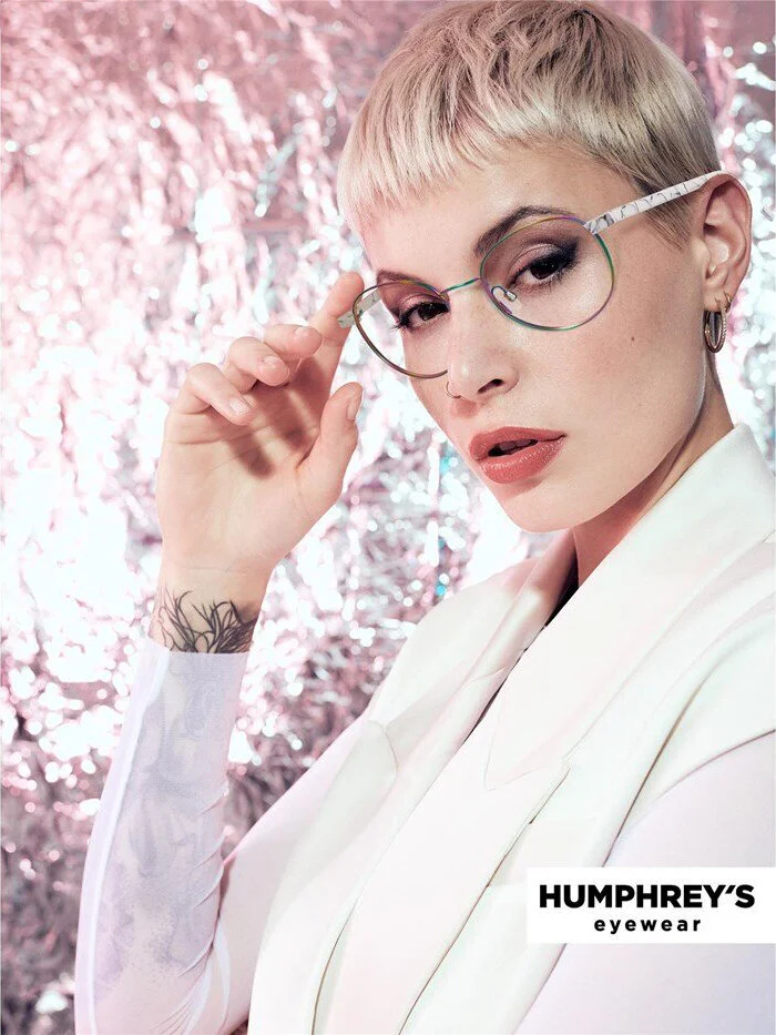
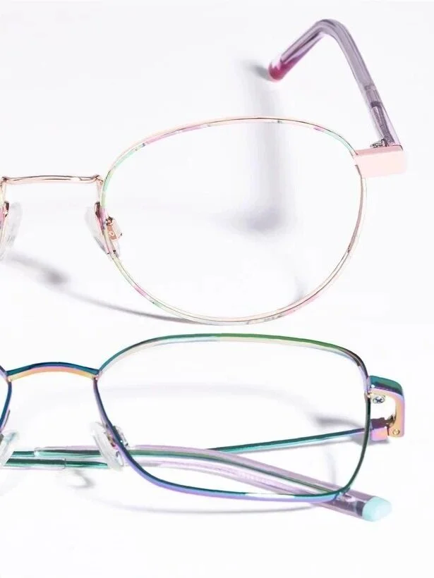
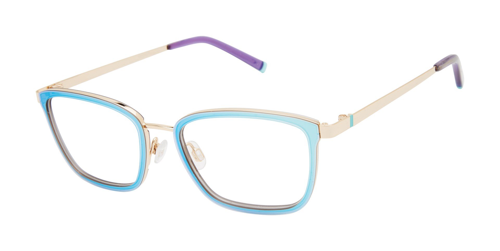
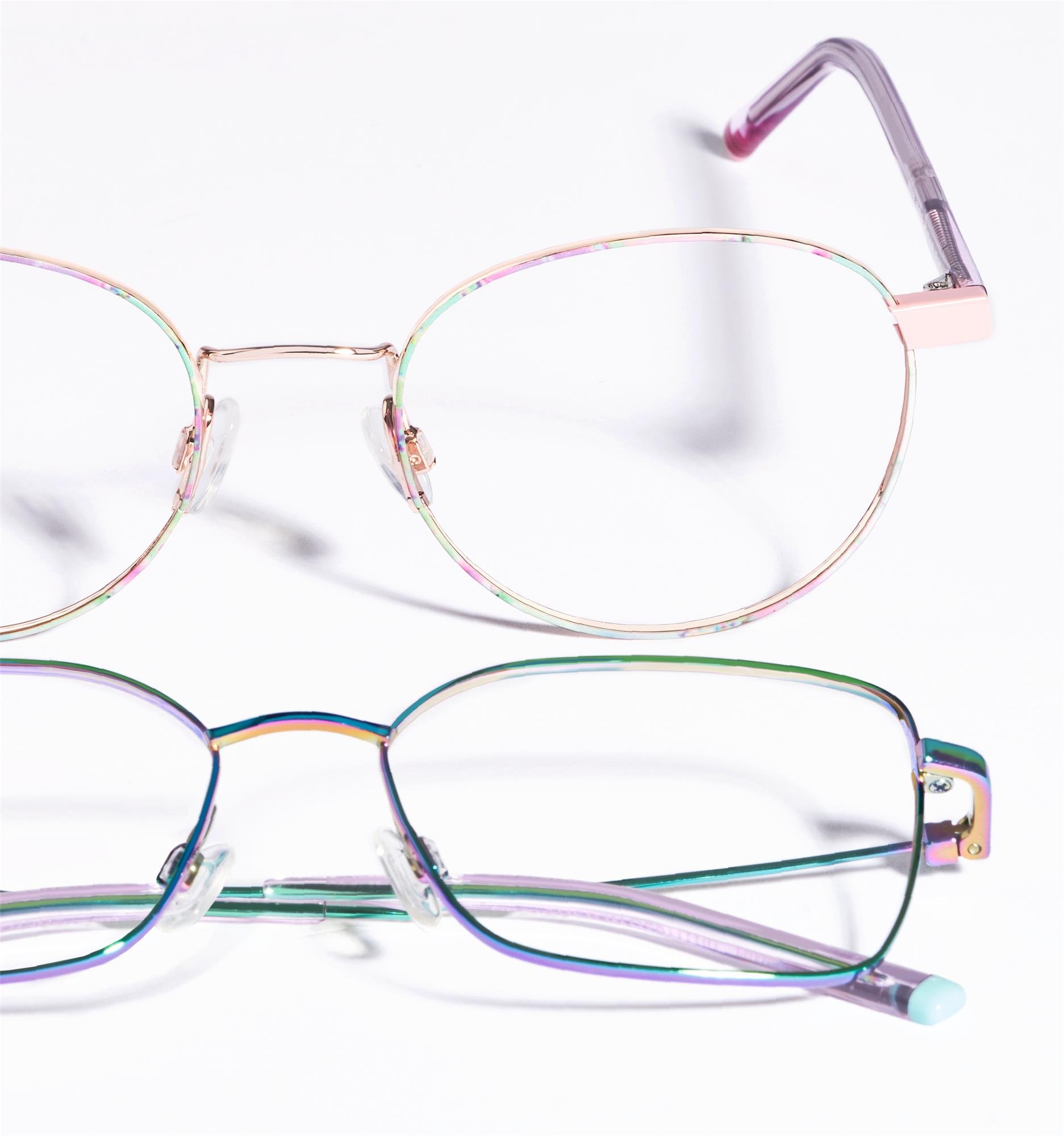
Colors: clashing, virtual chromatics were balanced by wearable neutrals. I developed custom hydrographics that are bright, patterned, and multicolor, that could be applied to metal surfaces, which was not achievable with traditional plating techniques.
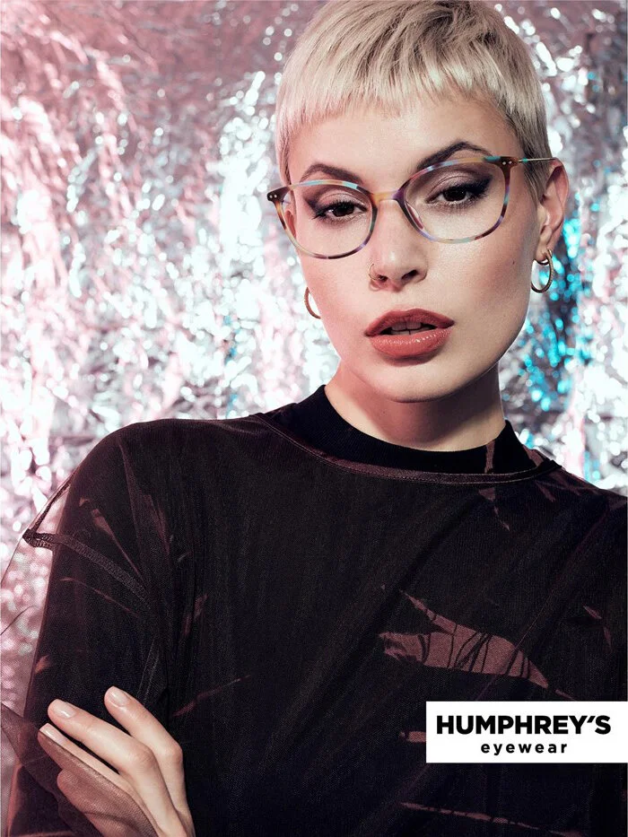
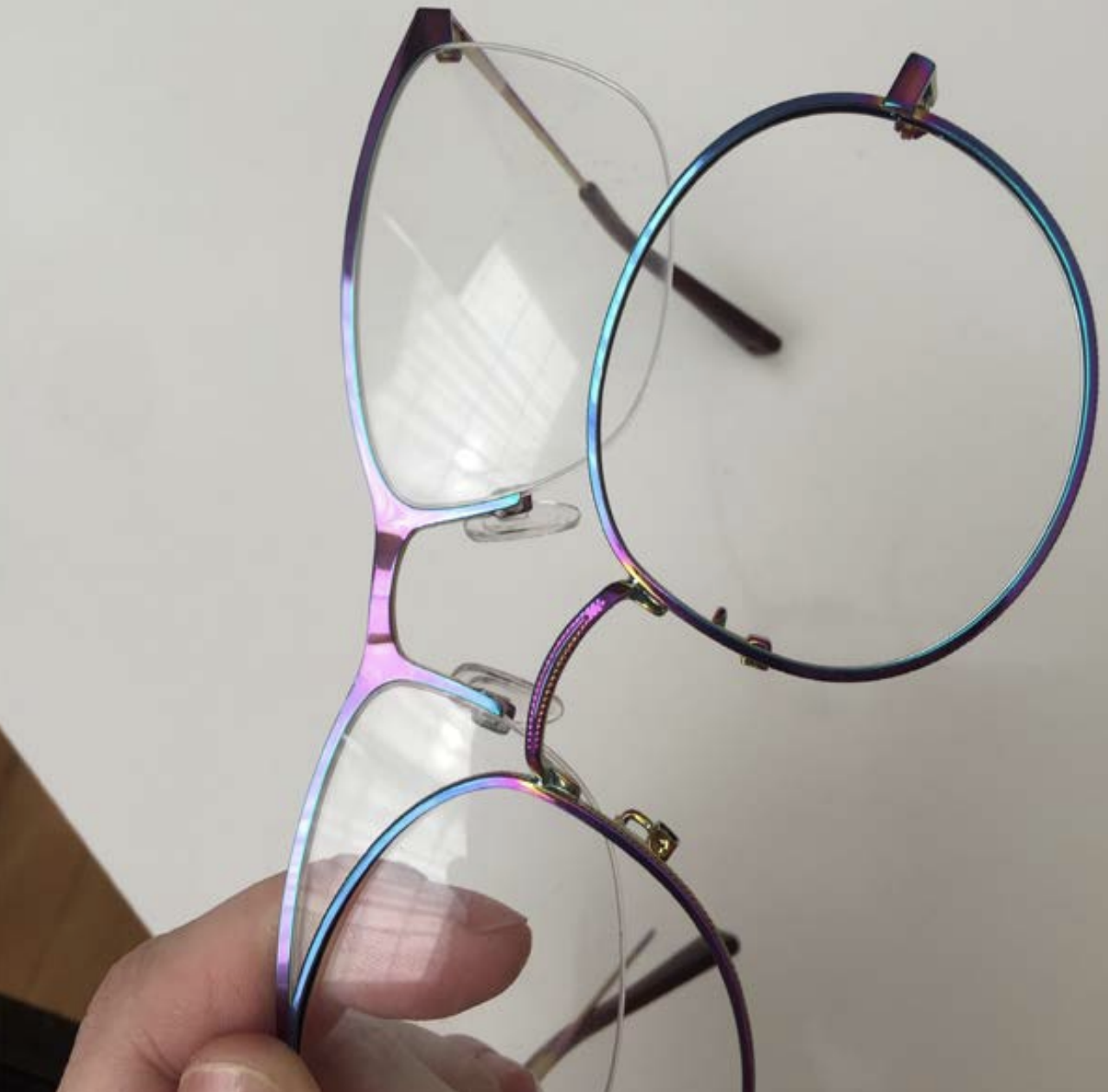
Materials: I worked closely with a vendor to experiment with different manufacturing techniques to create iridescent acetates, completely novel to the market. The acetates changed colors under different lighting, mimicking digital screens.
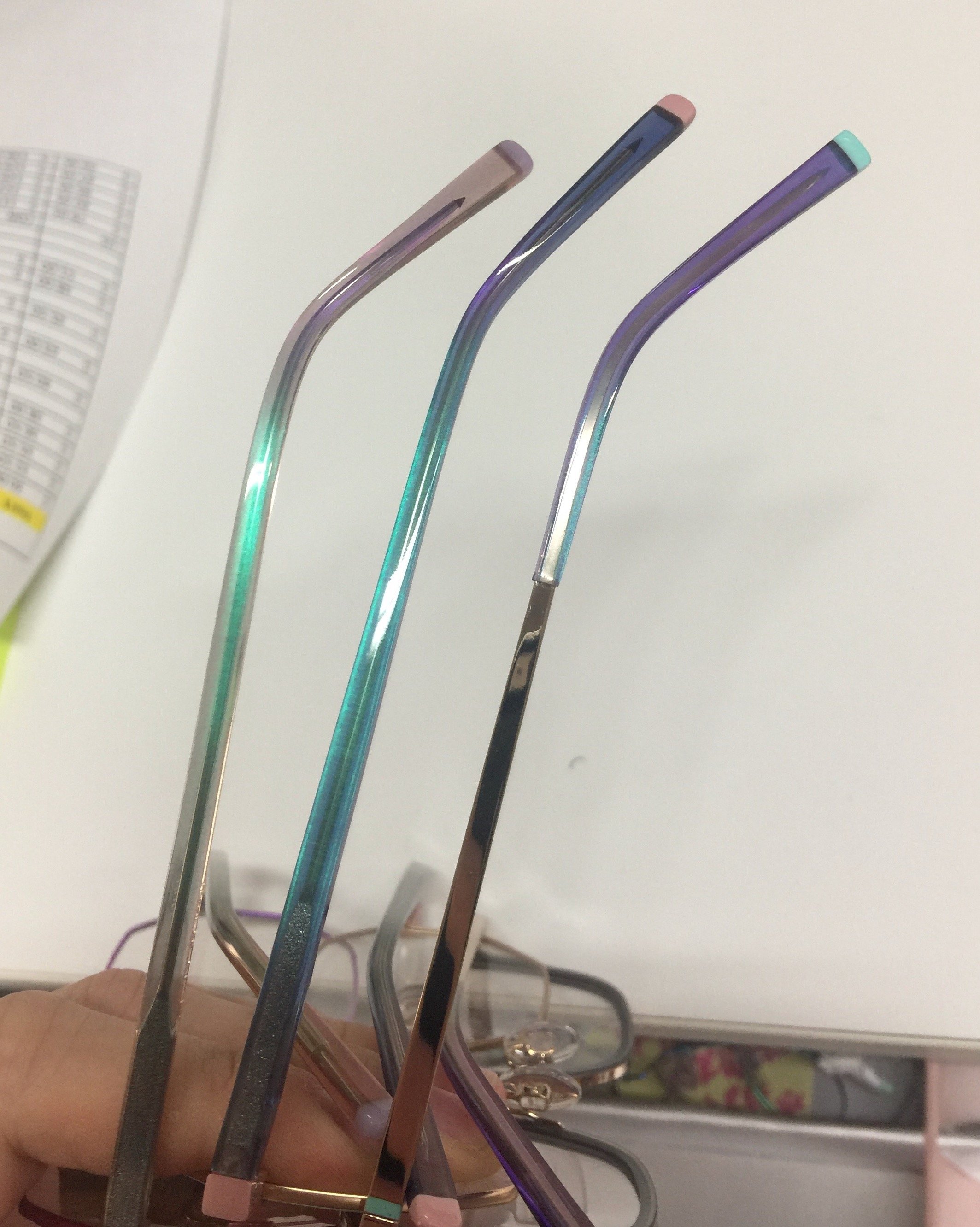
Finishes: Few facilities had the capability to produce iridescent plating on stainless steel. I worked with several vendors to develop iridescent platings that would comply with rigorous eyewear testing standards, delivering a novel plating color previously not seen in the eyewear market.

Key colors for the collection.
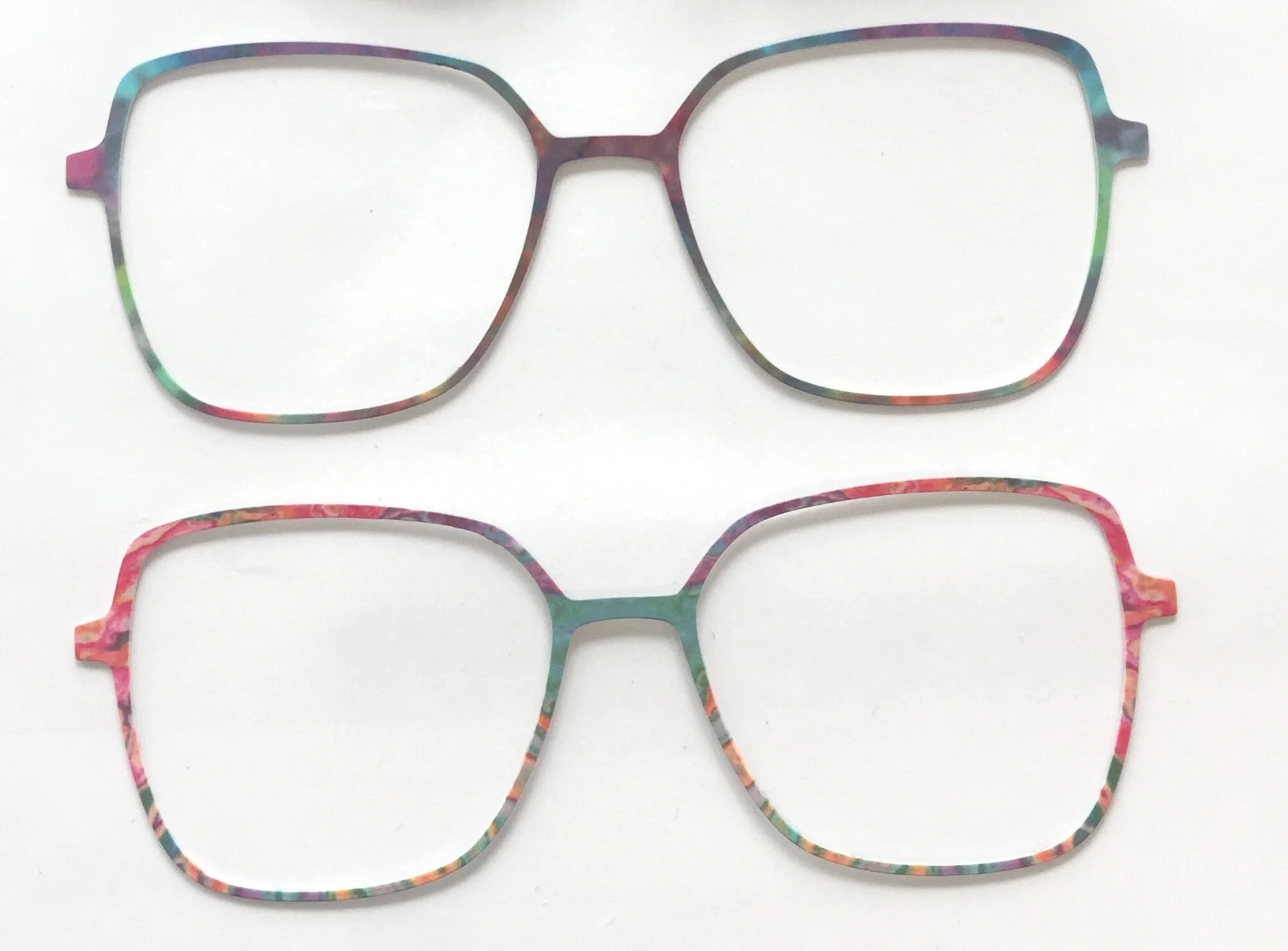
Glitch-art-inspired hydrographics captured the playful, digitally-inspired color palette.
Iridescent acetate after countless experimentations with a material vendor.
Iridescent plating color samples from different vendors. Each sample was evaluated for its colors, consistency, and quality.
prototyping + MERCHANDISING
Initial prototypes were developed with overseas vendors to validate the constructions, ergonomics, and new CMF concepts. Vendors were assigned based on capabilities and pricing.
Rigorous QC was conducted on each round of prototypes. Size, construction, ergonomics, and colors were scrutinized. I closely monitored the entire supply chain to tackle quality issues upstream. Design revisions were applied to each design before production to ensure proper ergonomics and quality.
The Digital Punk collection was strategically merchandise to respond to the aforementioned market and consumer insights. To further hone in on the specific merchandising needs for the collection, I created a new sales analysis methodology which identified the relationship between different product attributes with sales performance, allowing me to establish:
Business driving product attributes (size, materials, constructions, etc.)
Over/under assortment in specific product attributes
Gaps in the assortment
Backed by these data insights, I addressed the gaps in the product line and further capitalized on business driving products, ensuring longterm sale-through. I merchandised the colorways in each style to compliment, not compete, with each other.
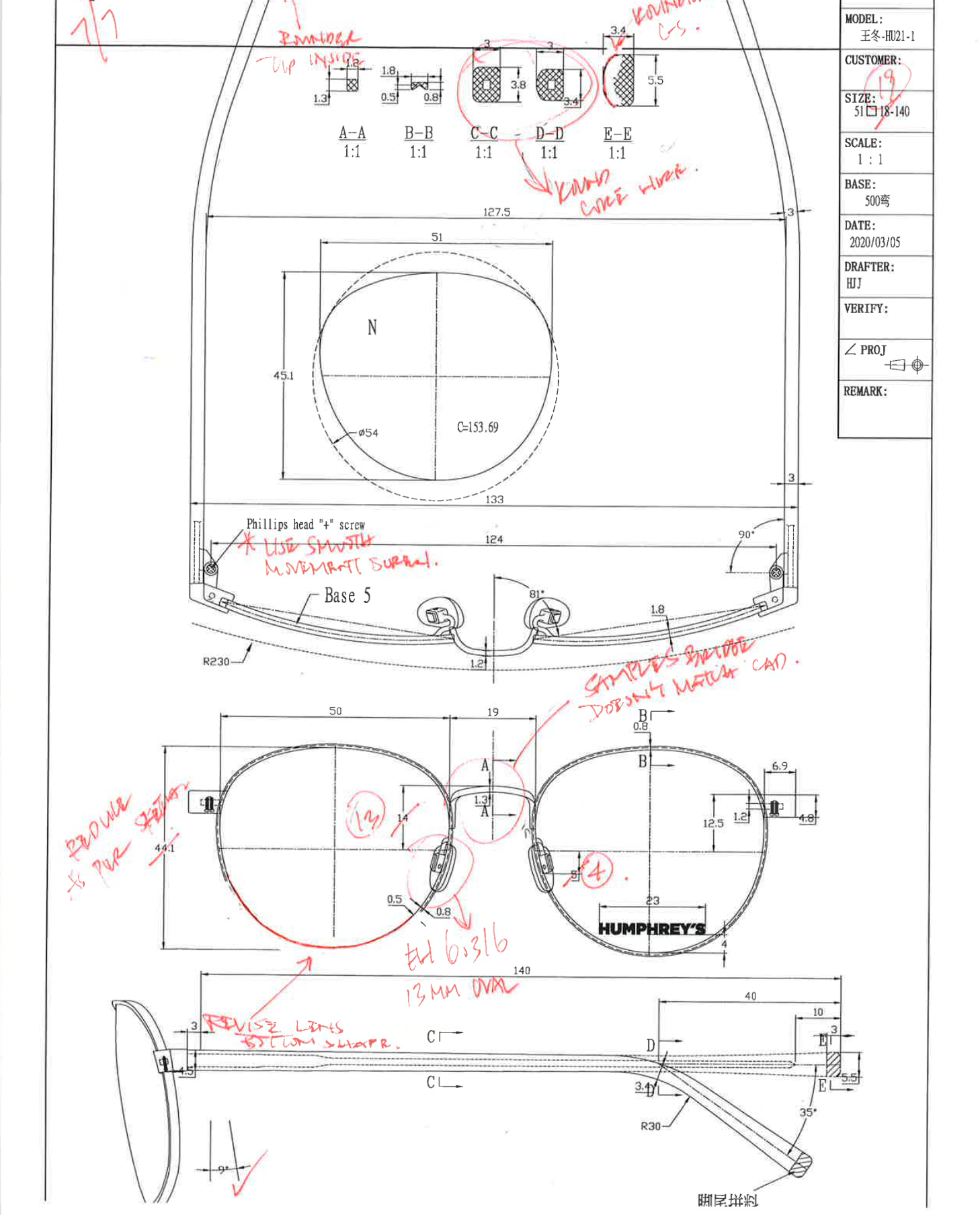
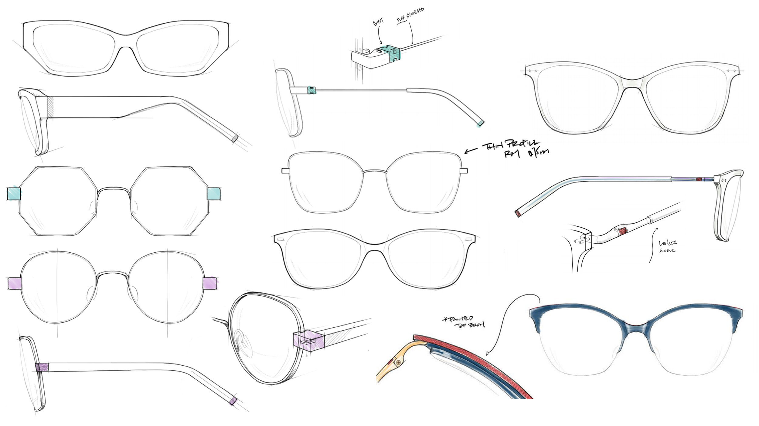
Each technical drawing was scrutinized and revised before confirming for production tooling.
Final Designs + results
The Digital Punk collection released in January 2021. The collection continuously exceeded 2021 sales plan, experiencing over 10% year-over-year growth, and received overwhelmingly positive feedback.
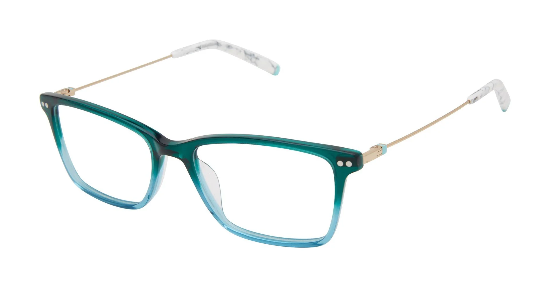
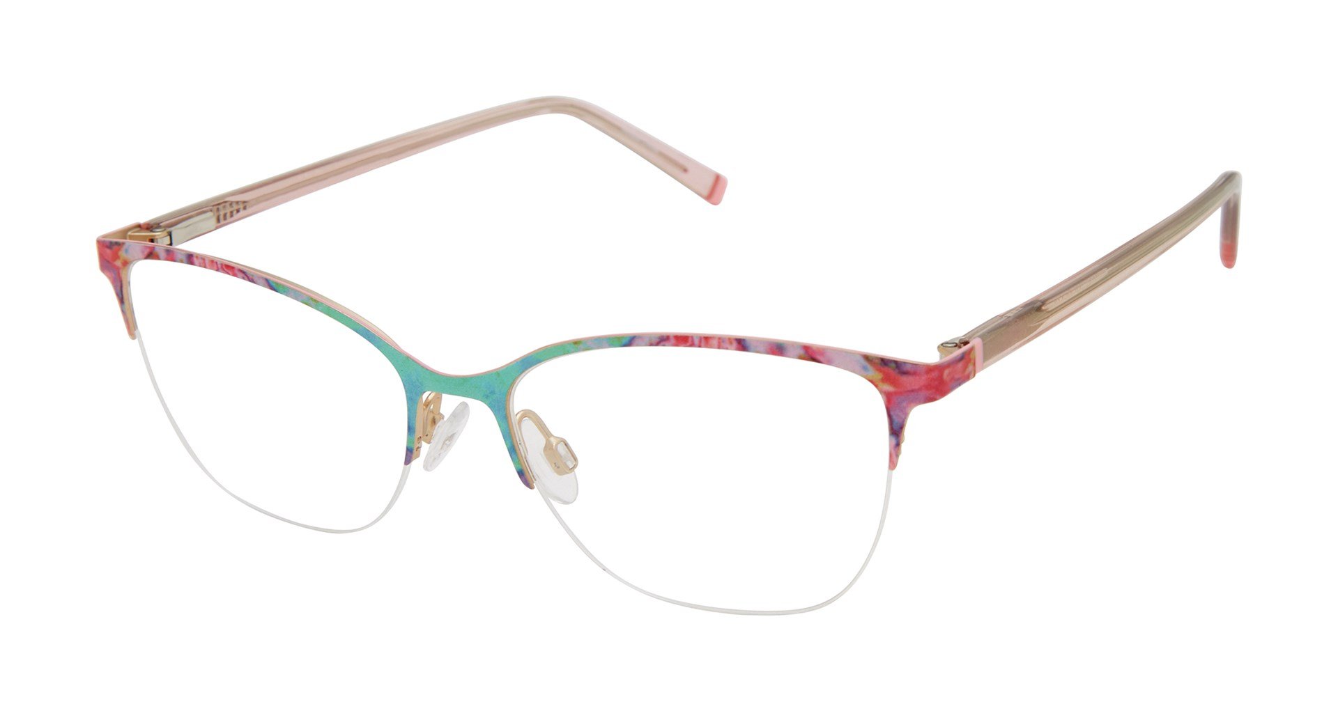
Below are select examples of final designs. The full collection is available on the Tura website.